
|
|
EF! and Caslon Antique |
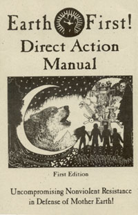
I'm don't know whose idea it was to use it, but I first noticed it on the masthead of the Earth First! Journal and the headlines of of some EF! fliers: a typeface known as Caslon Antique. Soon it was on all sorts of EF! literature, and the cover of the EF! Direct Action Manual is typeset in it. It's a fine typeface, and using it in defense of Mother Earth is a fine idea.
EF! has managed to make give this typeface a strong association with environmental direct action, particularly in defense of ancient forests. I was especially amused to see that the Sierra Club, when trying to show that they were taking a firm position on forest protection, used Caslon Antique in one of their newspaper advertisements. I guess the idea was to give the impression that they'd regained some of their edge.
I encourage EF!ers and other direct action environmentalists to make good use of this typeface. A Caslon Antique "font file" is easy to find, and you can use it for printing up your own great documents! Just find a good web search engine and search for a combination of "Caslon Antique" and "font". I know of a freeware version stored in a file named "casla___.ttf" and identifying itself as "CaslonAntique" (with no space between the two words), and a somewhat nicer version that you can pay a reasonable price for, calling itself "Caslon Antique" (with the space).
If you download one of these font files and install it on your computer, the dark green titles and section headers on this page will be displayed in Caslon Antique -- as will parts of all my other Earth First! pages. Believe me, they look a lot nicer that way!
You might wonder why I'm bothering to devote a web page to this typeface. Well, if you're an Earth First!er, I'm glad to bring it to your attention: it's pretty simple to download or buy the font file, and then you'll have a really nice resource to work with. Also, it'll help my web pages look nicer.
Of course, there's also the fact that I just really, really enjoy this typeface. It's kind of irresistible.

If you install the font file on your computer and surf around my web pages (which is, of course, something I'd encourage), you'll find that I make use of Caslon Antique here and there. It's sort of like putting out "Easter eggs" for folks who've installed the font. You might also notice it being used in some of the graphics files I've made for these pages. Note that some of my other graphics use an antiqued typeface known as Ticonderoga. For example, the title graphic on my home page -- which I call an "Eco Page" -- uses Ticonderoga.
I'm going to let you all in on a little secret: Caslon Antique is a fake.
Never mind the fact that it's not really based on Caslon, which is a fine typeface in its own right -- fine enough to have been used for the U.S. Constitution, in fact -- No, I'm talking about the fact that it's an "antique" font.
All antique fonts are sort of fake. Part of their charm is that they look as if they're made with some well-worn hand-set type. It's nice to have something that evokes this charm, of course, but the real thing is always better. You might not have a printing press where you can set type by hand, but you could always do some hand-lettering.
Hand-lettered fliers (and other documents) have a certain natural warmth to them that you'll never get from something that's produced entirely by computer. The human touch makes a big difference. Give it a try! A good way to start is to view or print up a few things with headlines in Caslon Antique, and try to copy them. If that doesn't work out for you, try tracing them. Trust me, it really will look better.